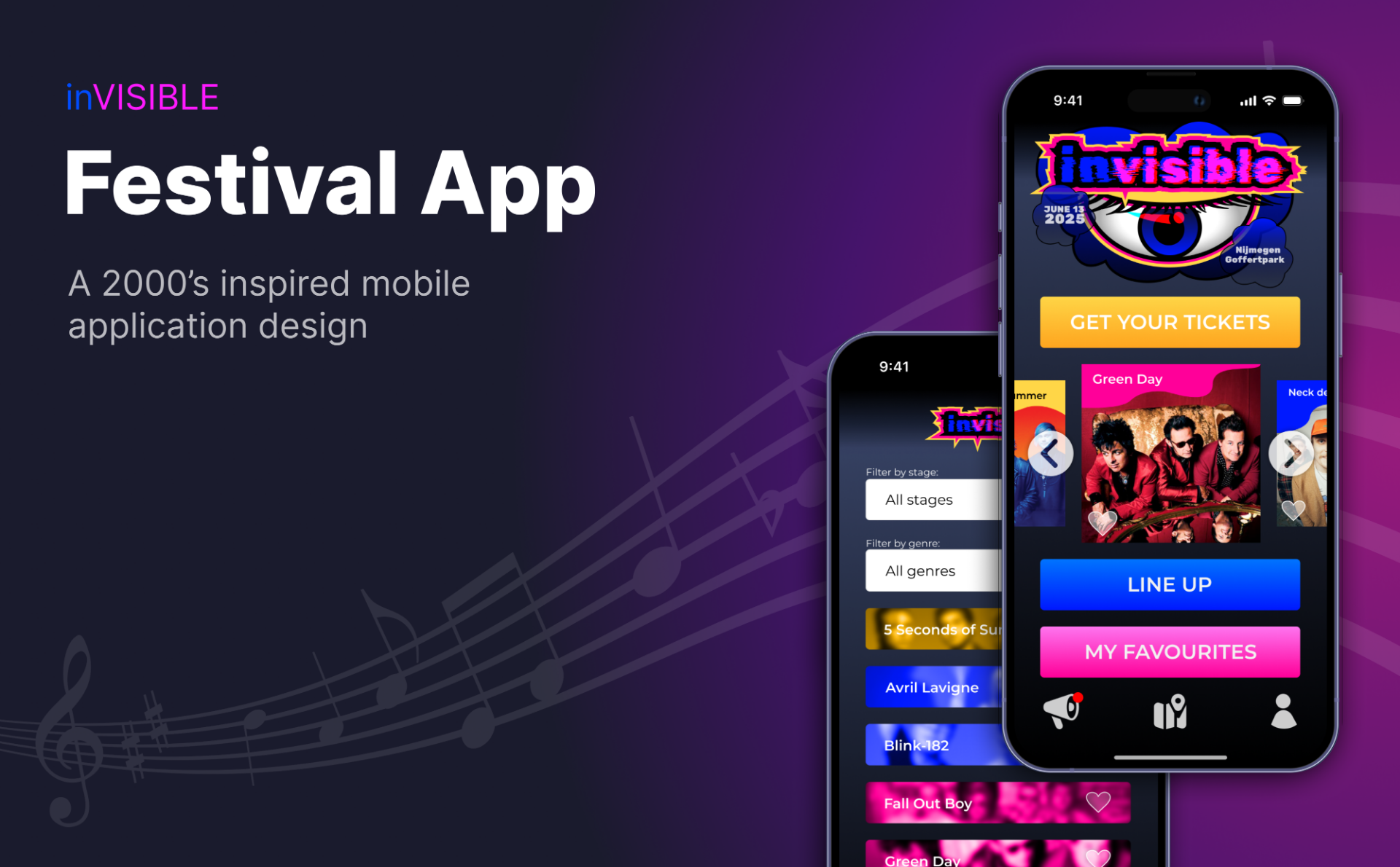
inVISIBLE
This was one of my first projects and I mainly focused on getting to know all the features of Figma.
The prototype can be accessed through this button below:
The process
First I started by creating wireframes of everything a festival application should probably have and I continued to translate these into whimsical:
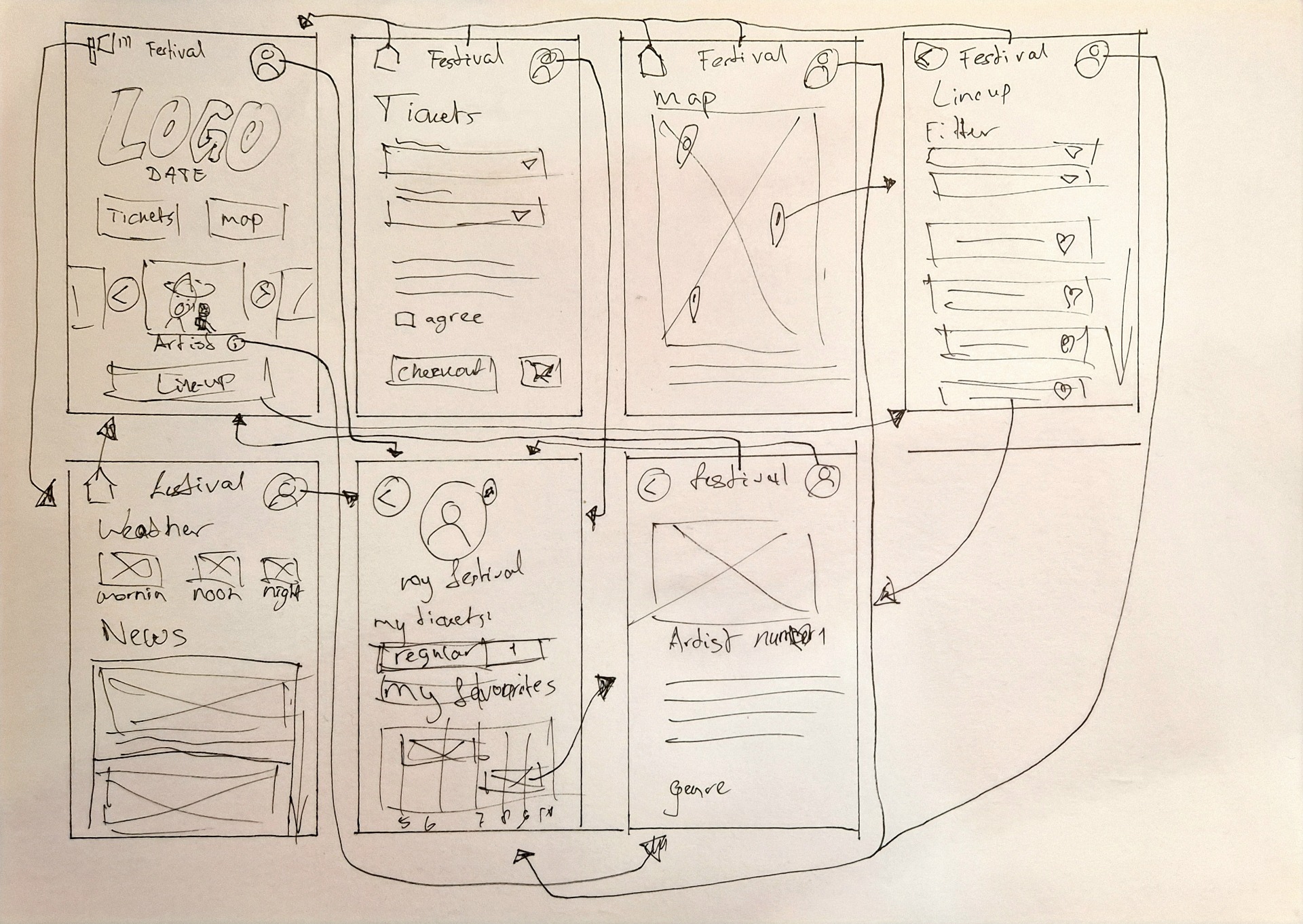
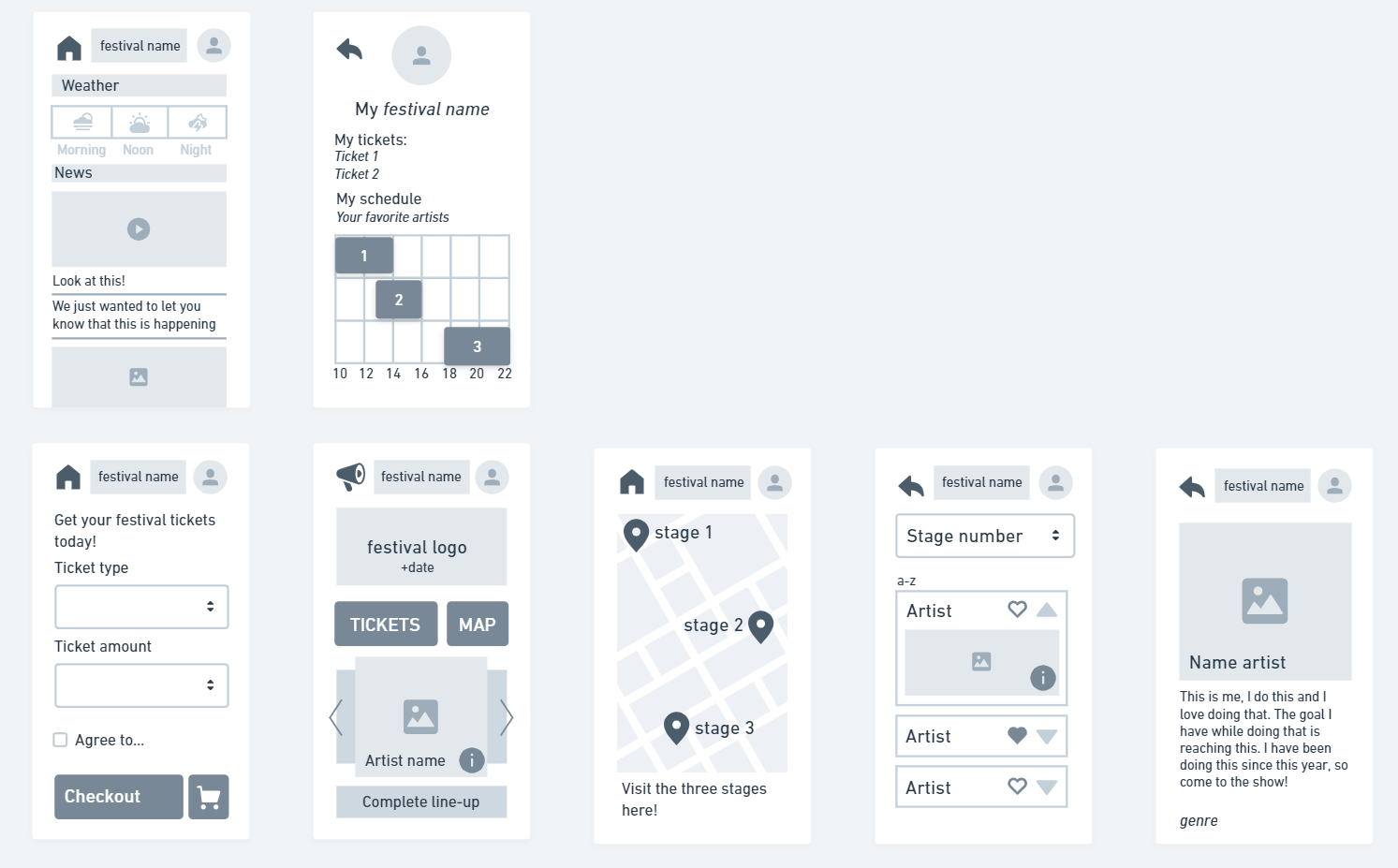
With these wireframes I did some user testing to see what worked and what didn't. You can read the full results in the document below, but the main take-aways were as follows:
- I realized that this wireframing wasn't thought through enough and having buttons next to the logo at the top of the page makes them less visible.
- The way the pages were organized does not make enough sense.
- I also definitely needed a separate button and page for favourite artists.
I updated the wireframes based on the testing:

Since I was going for a bit of an alternative festival that is centered around pop
punk / emo / alternative rock I wanted to use colours that are fun, yet also bring a bit of that
darkness and quirkiness that comes with the music which often has themes of
heartbreak and rebellion.
My target audience would be people that grew up feeling a bit rebellious and listening to artists
like Blink-182 and Avril Lavigne. So maybe people that had a rebellious kind of phase,
are in that phase now, or never grew out of it.
Because of my line-up, who are mostly artists that were popular 10-20 years ago, I want to bring this 2000s style into my app design too, almost making it look a little bit dated. The idea is to use a dark base with bright accents. My words: loud, nostalgic, alternative, energetic, fun
This is the moodboard I made with these ideas in mind:
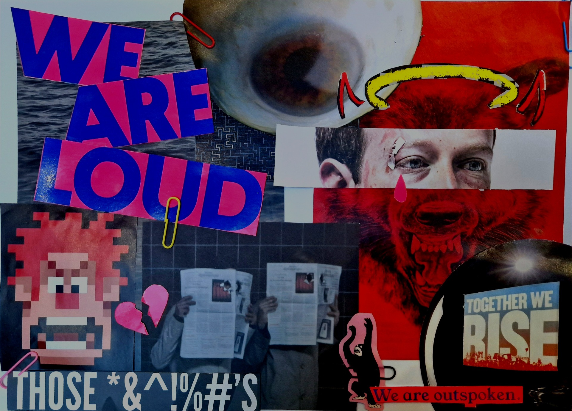
To translate my wireframes and moodboard into a functioning festival app prototype, I started with the base pages of the wireframes and applied the style of the mood board to it.
While designing I kept in mind that I wanted it to come out looking like an app with a nostalgic 2000s style.
I started out with creating a colour palette in Figma and setting text styles. I contemplated using a chaotic font like on cover albums, but that would've made everything unreadable so I limited that to the logo. Inspired by the eye of my moodboard I used that as a base for my logo and made inVISIBLE the name of my festival, referring to the music genre's stereotype, being an outcast, therefore inVISIBLE. A similar example is the theme of heartbreak and your suffering being invisible to the one you love etc. VISIBLE in caps is because the artists are making themselves visible with their music.
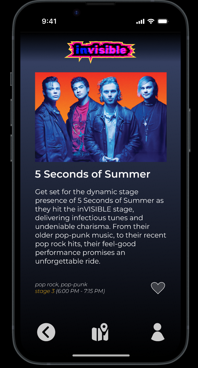
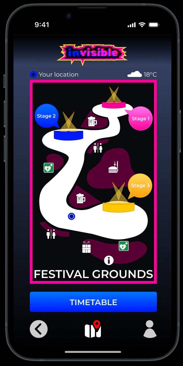
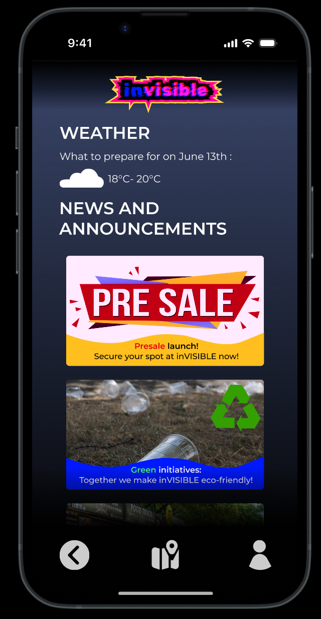
Here follows the first protoype I made based on the wireframes and moodboard:
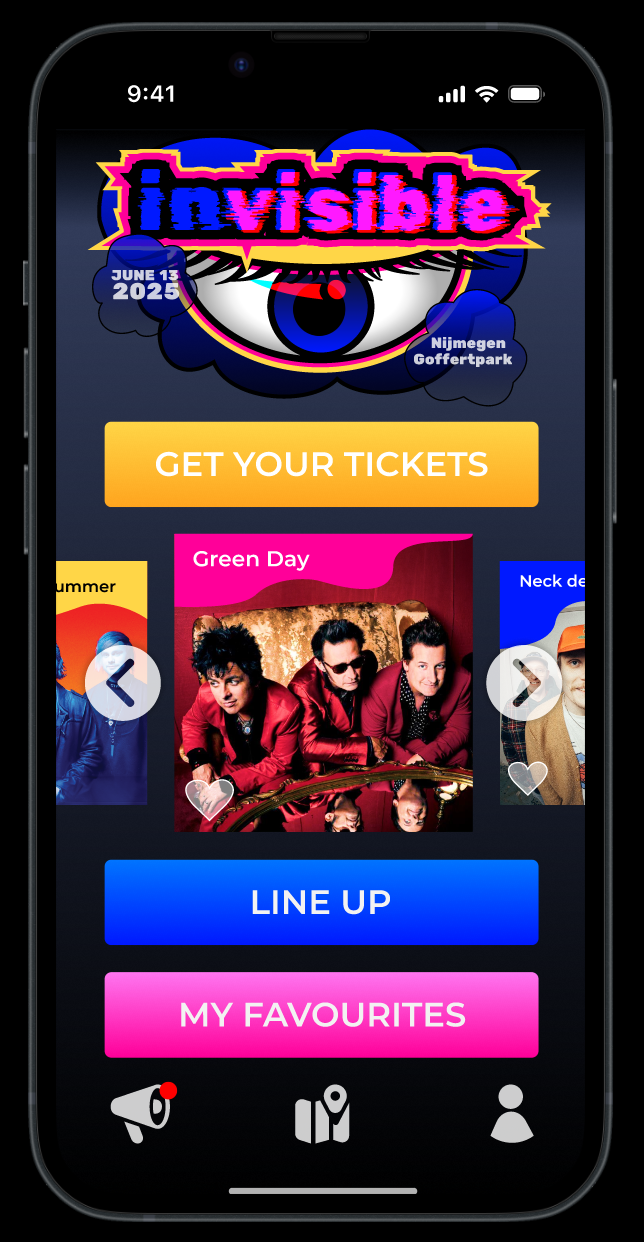

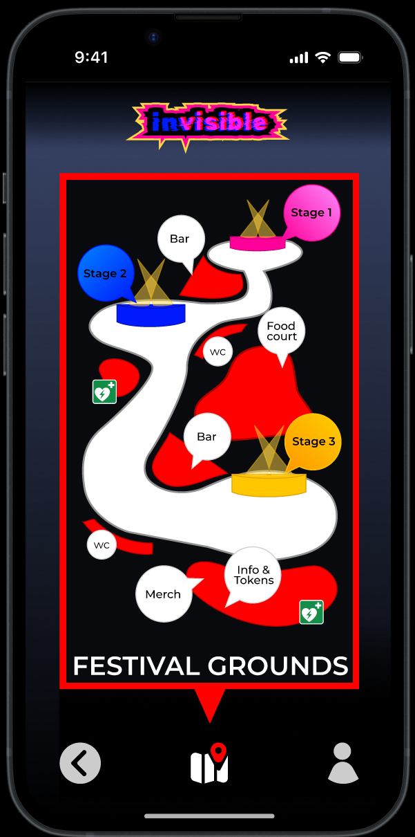
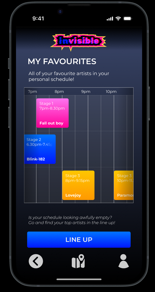
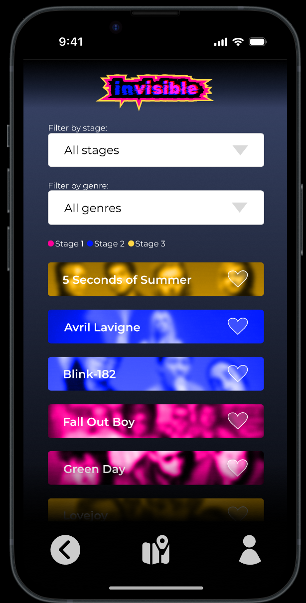
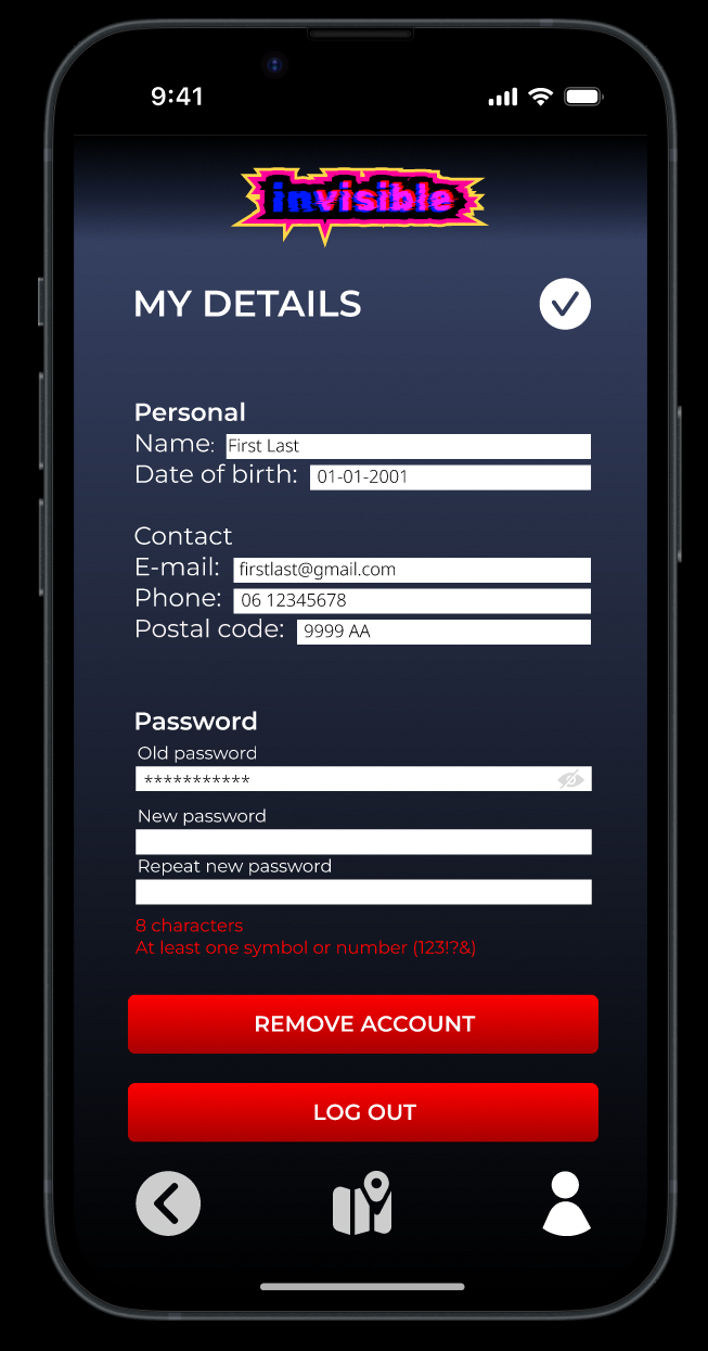

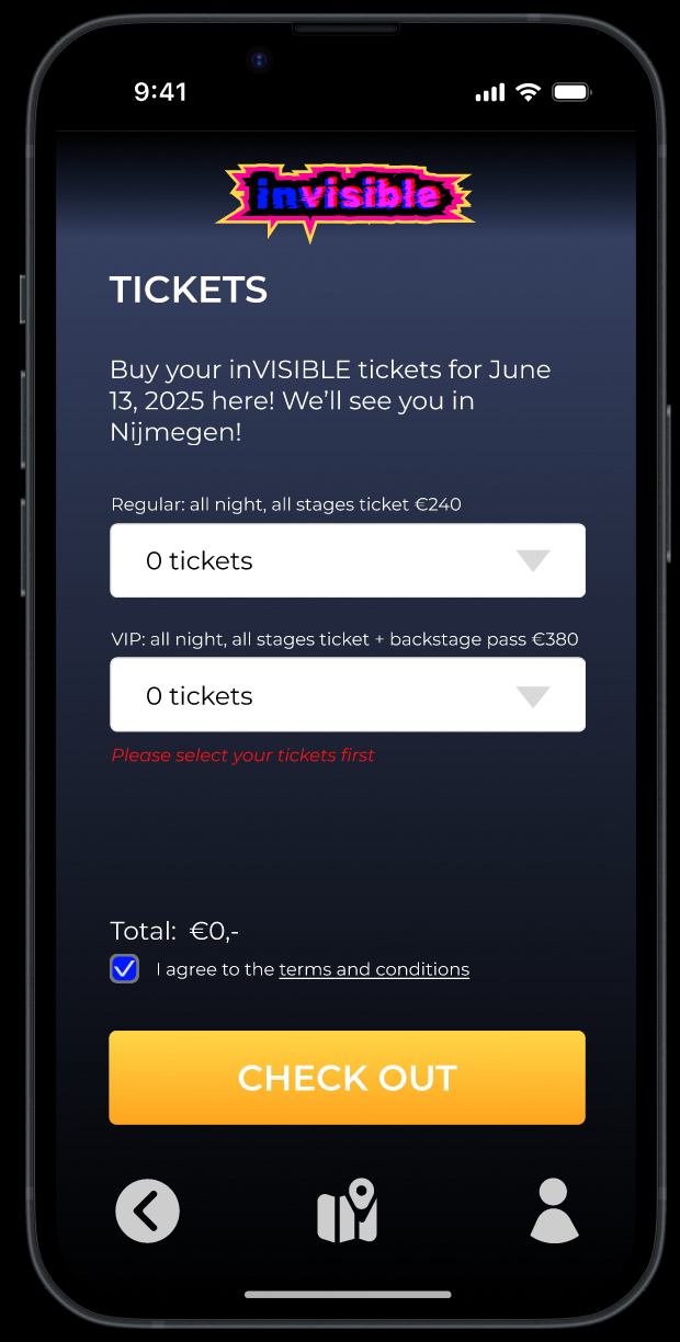
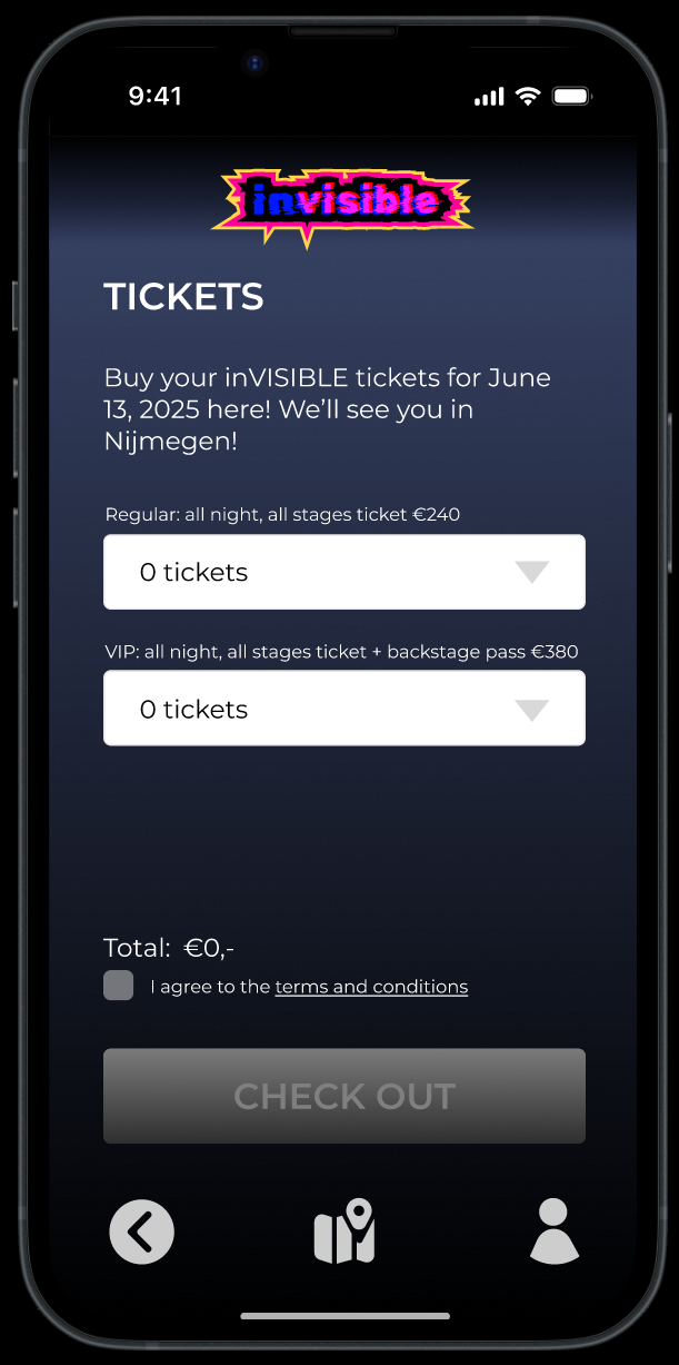
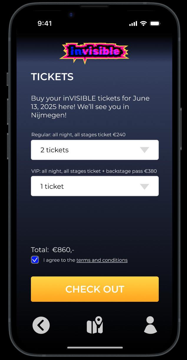
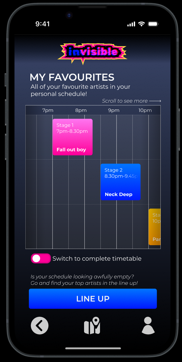
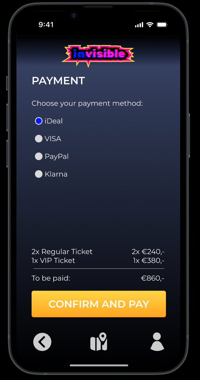
I focused on developing my skills to make prototypes fully functional, so here are some examples:
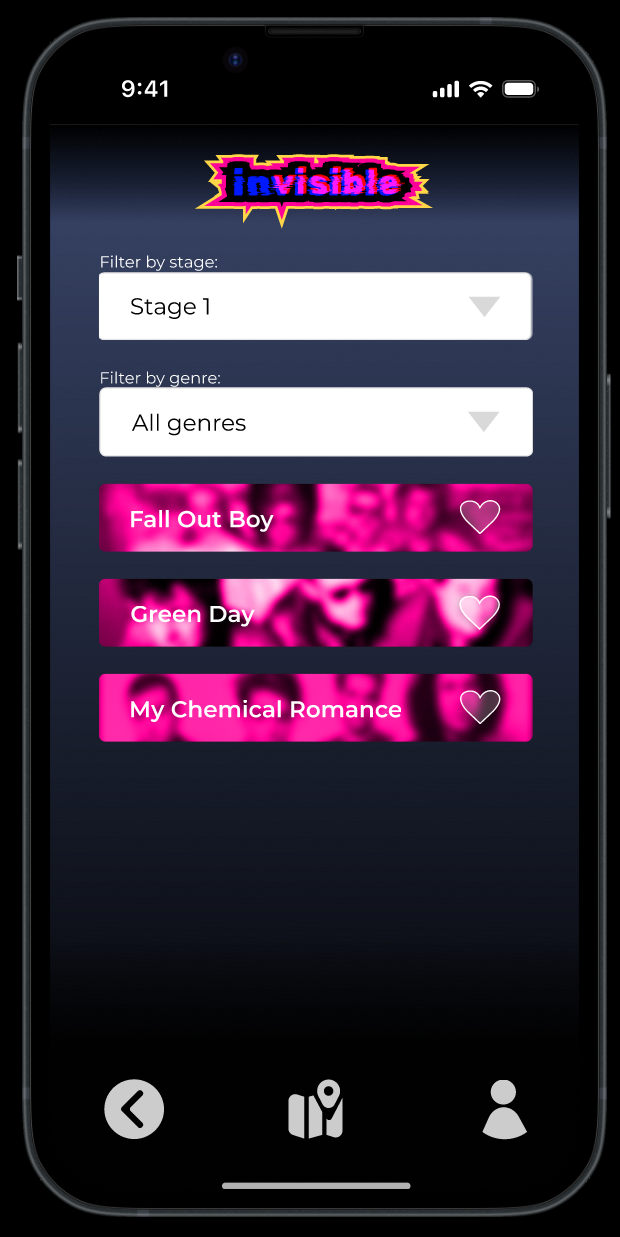
- Filters are completely functional, even when multiple filters are used at once.
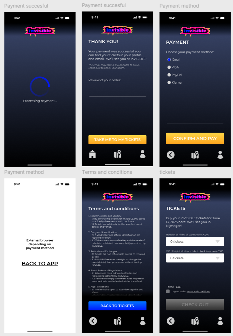
- When you choose tickets, for any amount of each ticket type the total price is added up and displayed correctly.
- When songs are added to favourites, they are displayed in your personal schedule.
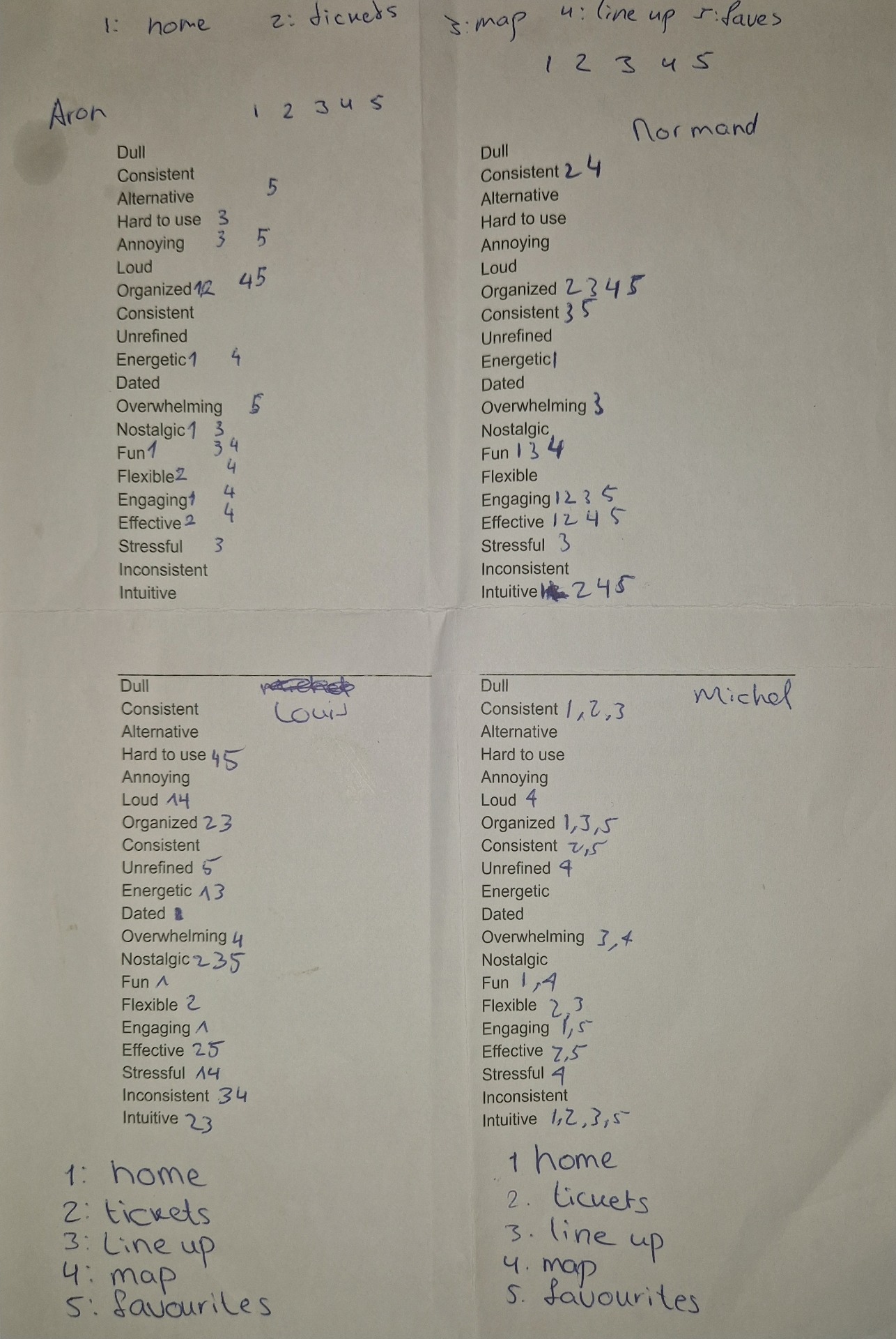
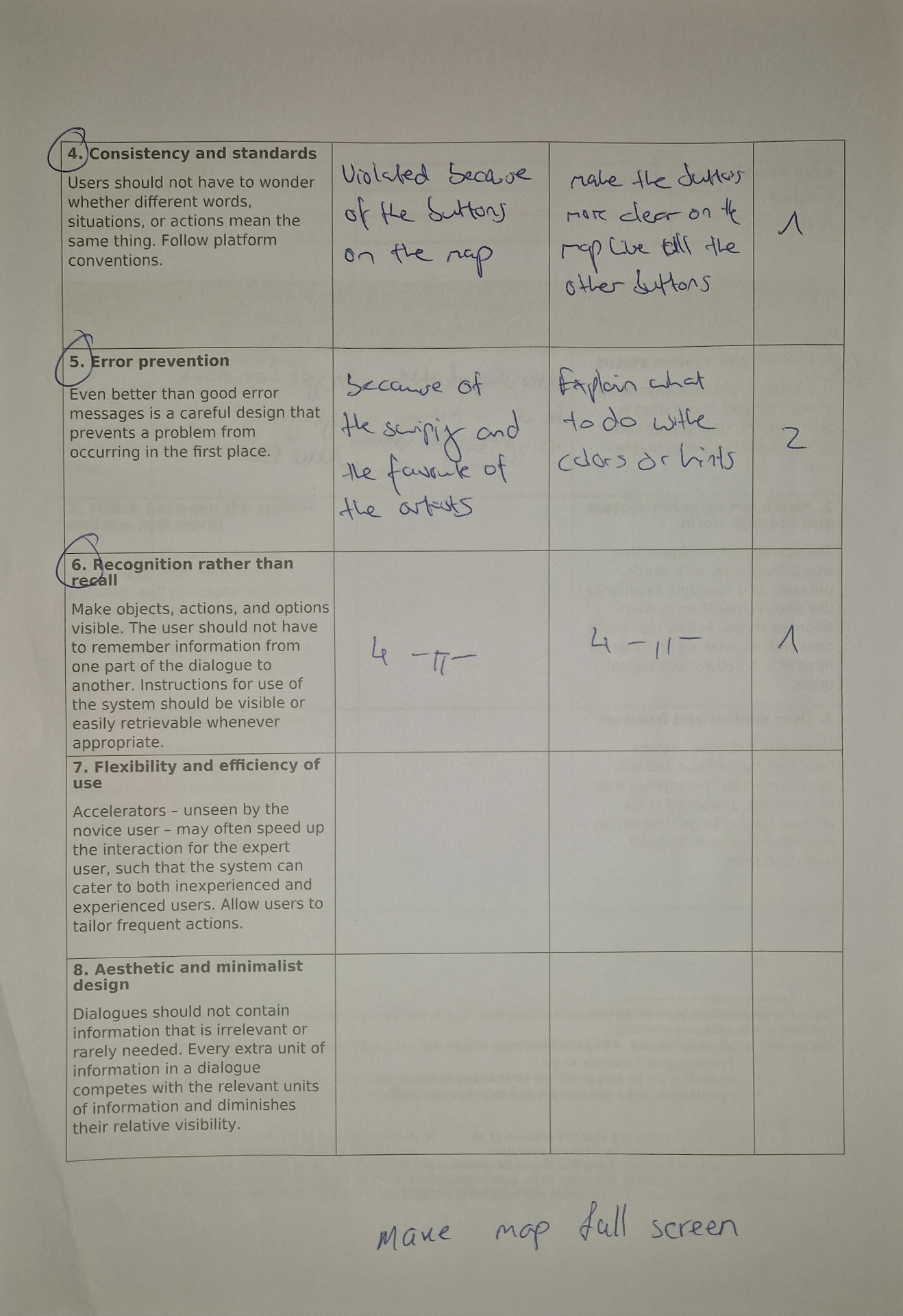
For this user testing, I did a word association and a heuristic evaluation. I gave participants a list of words and they could pick whatever they felt applicable to what was in front of them.
Examples of the testing:
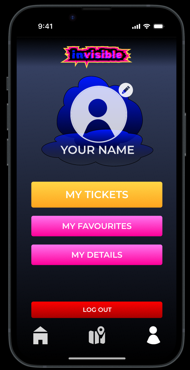
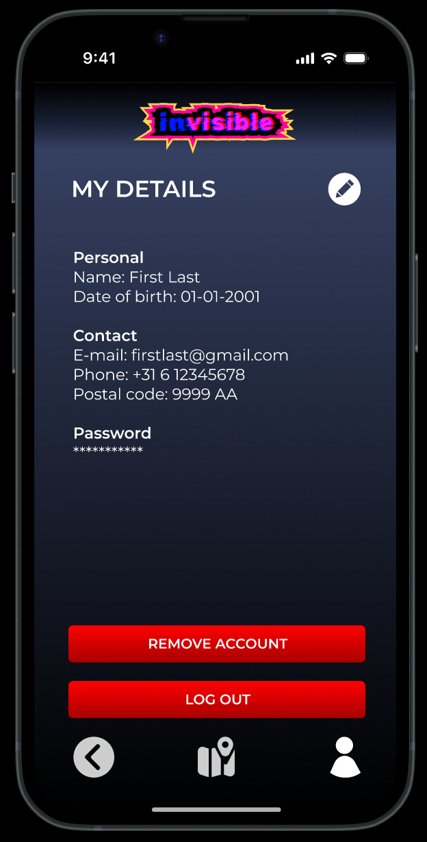
From the testing and feedback, I proceeded to apply some final changes to the prototype, like removing the red and providing navigation that was more clear, and that concludes this project.

