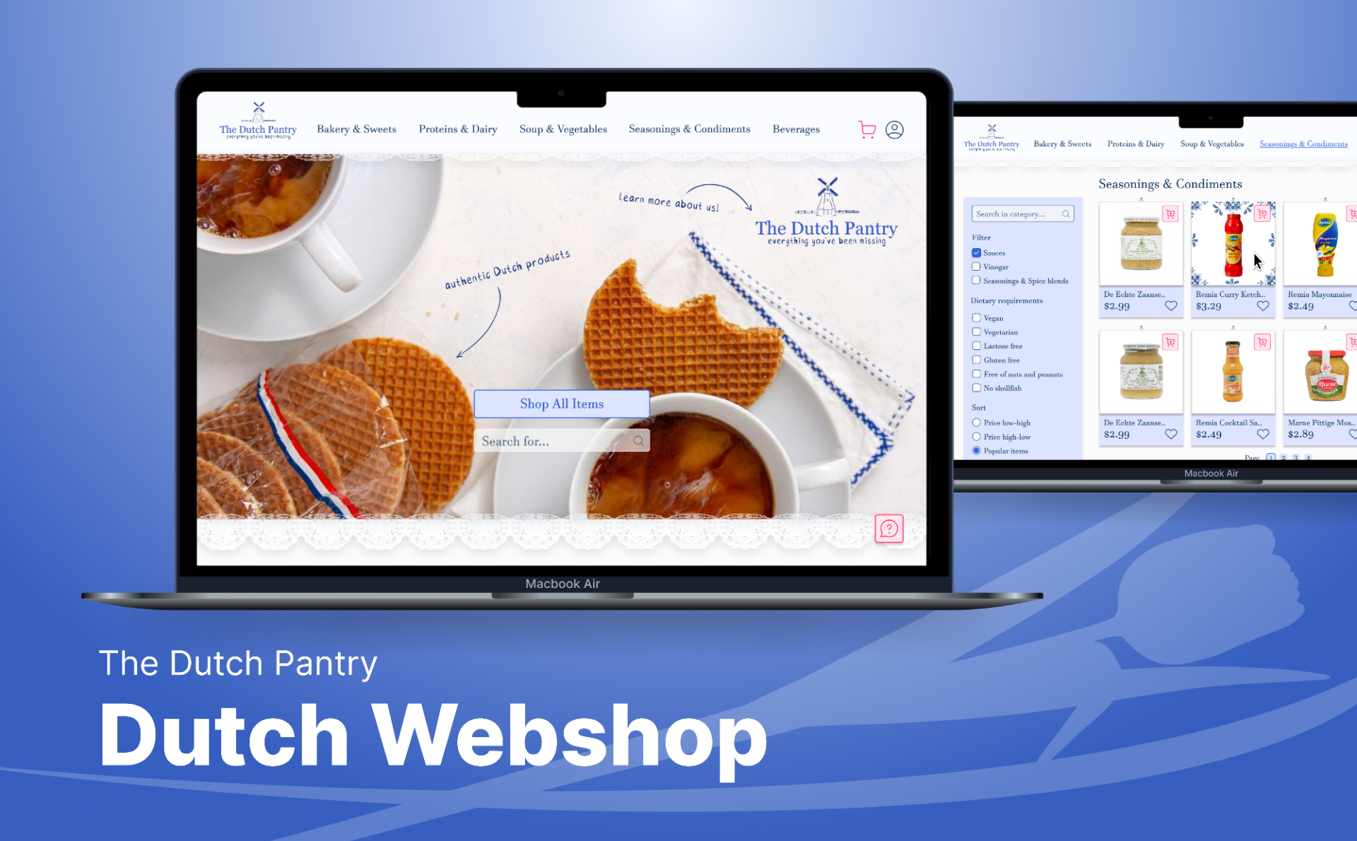
The Dutch Pantry
This is a store that was designed for selling Dutch foods and drinks in the United States.
The target audience consists of Dutch people that moved to the United States of America that miss the products from home.
The figma prototype for this project, is more a demonstration of the design and its component states than a completely functional demo:
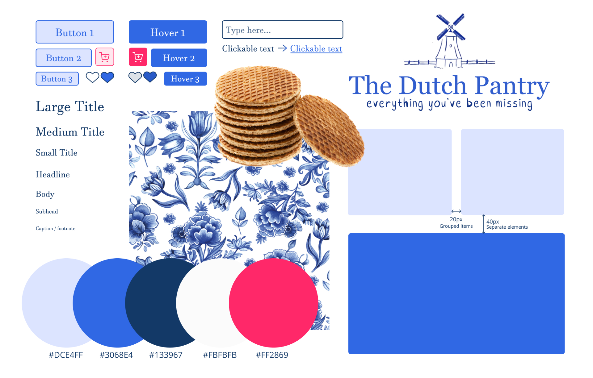
Style tile:
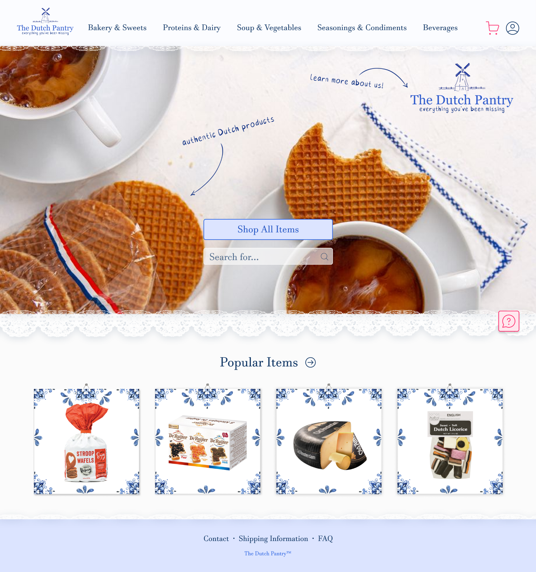
The Home page shows the logo with a picture of stroopwafels creating an overall dutch and homey atmosphere, especially using colors such as blue and white. The page is not too cluttered and gives the user the possibility to clearly navigate through the application as well as a preview of the most popular items. Additionally for a clear and more efficient search of items, this page offers the user a menu bar on top to sort through the items better. It also has a search bar in the middle of the page to find specific items or just going through all the available products using a simple and concise design. If a user comes up with an issue, it is also possible to start a chat with the help desk on the right side to help the user out with their issue.
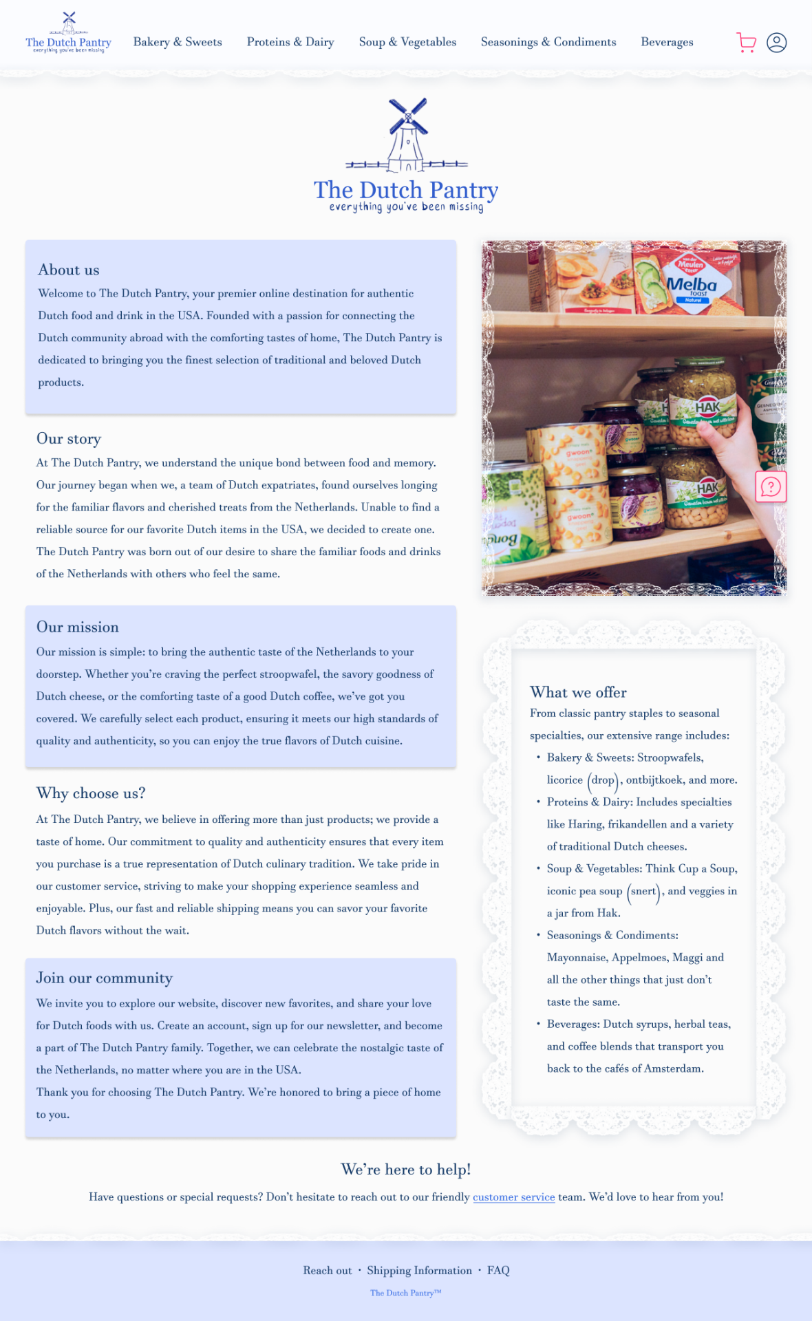
For the About us page I still wanted to go with the same homey feel. I did this by changing "contact us" into "We're here to help" / "Reach out to us!" and keeping the lace details. This page has way more text than the other pages, but they're split into paragraphs with titles so people can choose what to read about if they feel like getting to know more about one of the aspects of the website. The customer service link opens the chat from the help chat button.
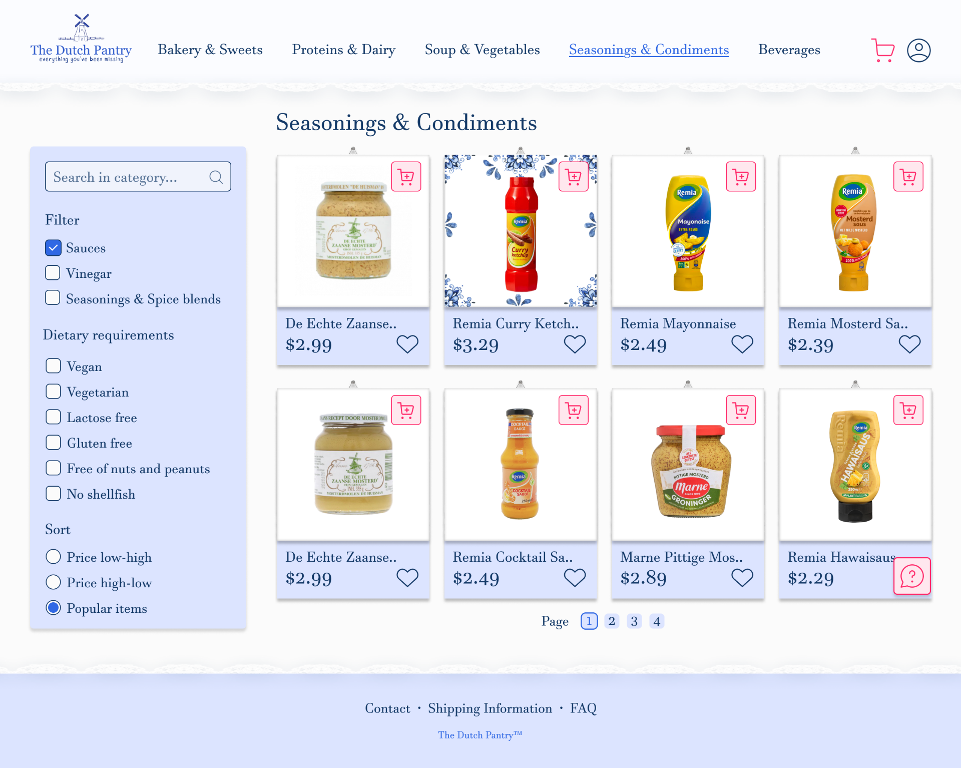
The product pages use pagination. Multiple option filters in the list have more of a rounded square, whereas the single option sorting of the product is round. This is to play into familiar patterns that users have. Lik eon every page, everything is evenly spaced (20px for the related items and 40px between separate grids. The user has the option to favorite items to their account and they are called to action by the contrasting add to cart button. When using the fast add to cart button from this page, one of the chosen item will be added to the cart and they can change the amount there. When a filter is clicked it immediately applies.
The items are made to look like hanging tiles, if you hover on them they turn into delft blue tiles.
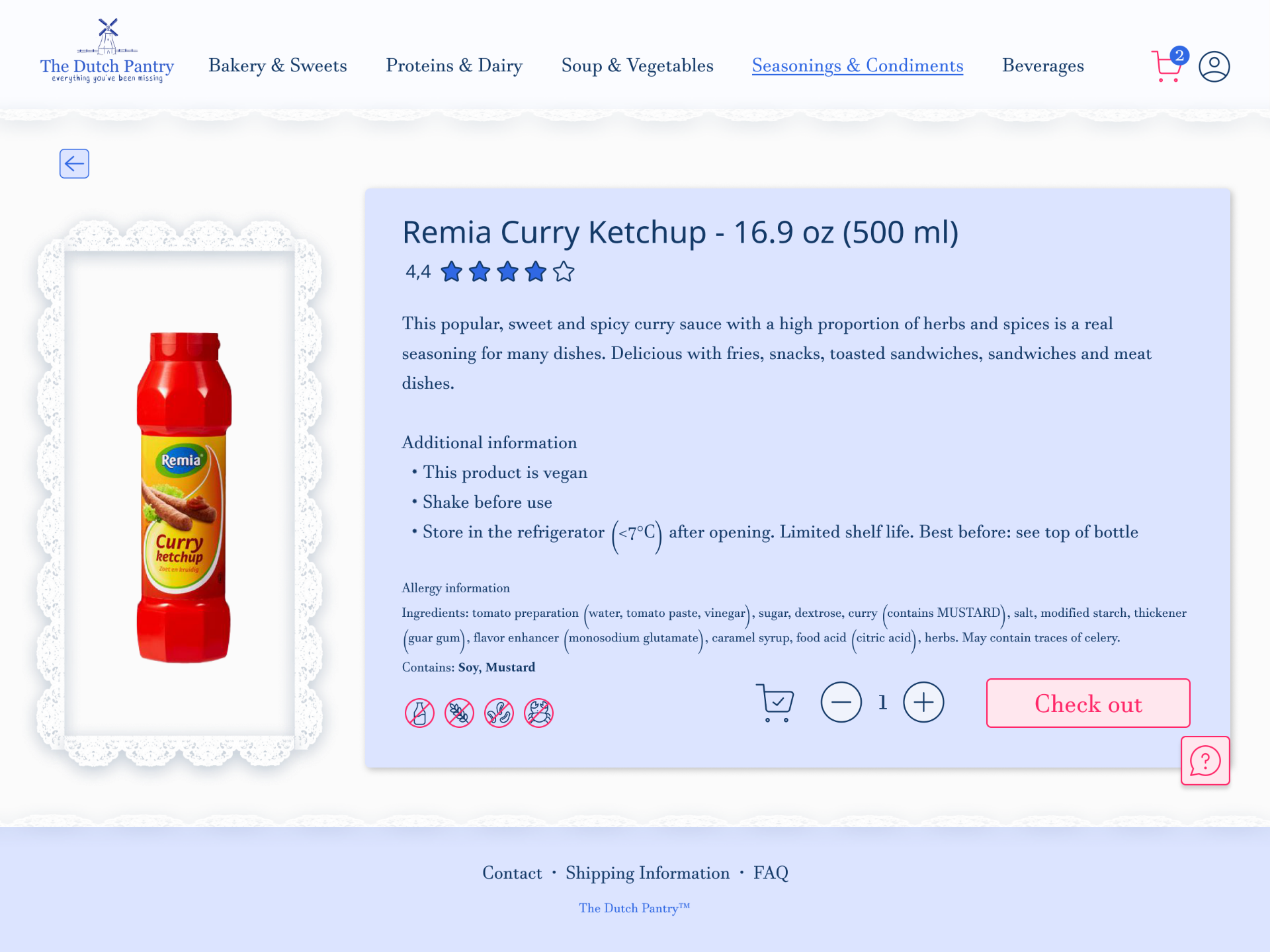
The main options and info on the individual product page stand out (allergy icons, big buttons, title) and left the description in a small font for people that feel like reading it. The check out button is again coloured in our call-to-action colour.
The product also has a rating that people can give when they receive their order. This allows people to build more trust with the brand.
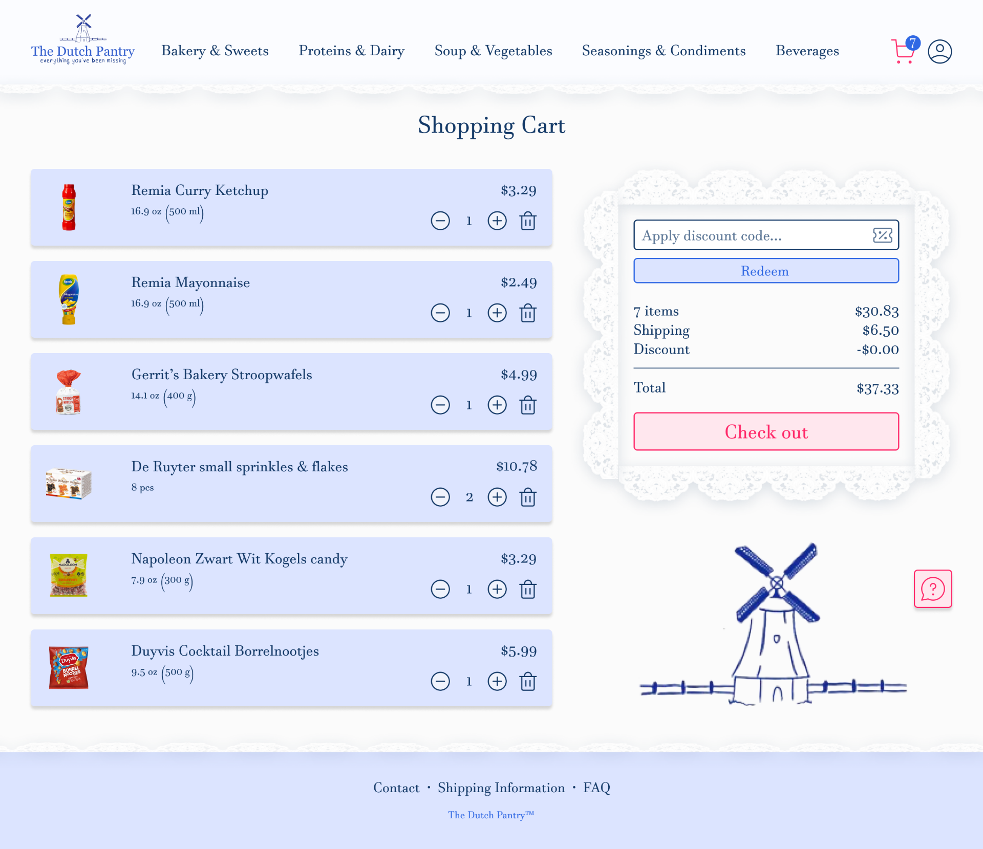
The shopping cart page gives the user an overview of their selected items they want to purchase. Showing the picture, the price and the amount of that item which they can change easily. Next to it is a trash can if the user decides to remove that item. On the right side the user sees the amount of money he would spend in total including the shipping price, this is a fixed item so even when you have a large shopping list and scroll down, it remains on the page. The user also has the chance to use a discount code to save some money. The hierarchy is very clear here so the user knows where to go next to check out. To add some atmosphere to it, a small design of the logo was used below, this logo disappears behind the fixed box.
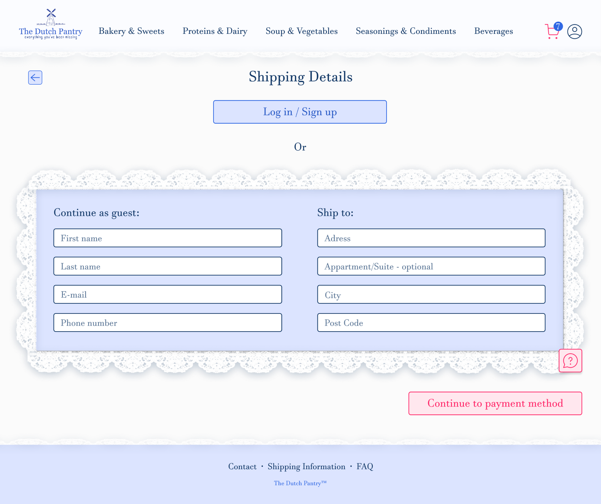
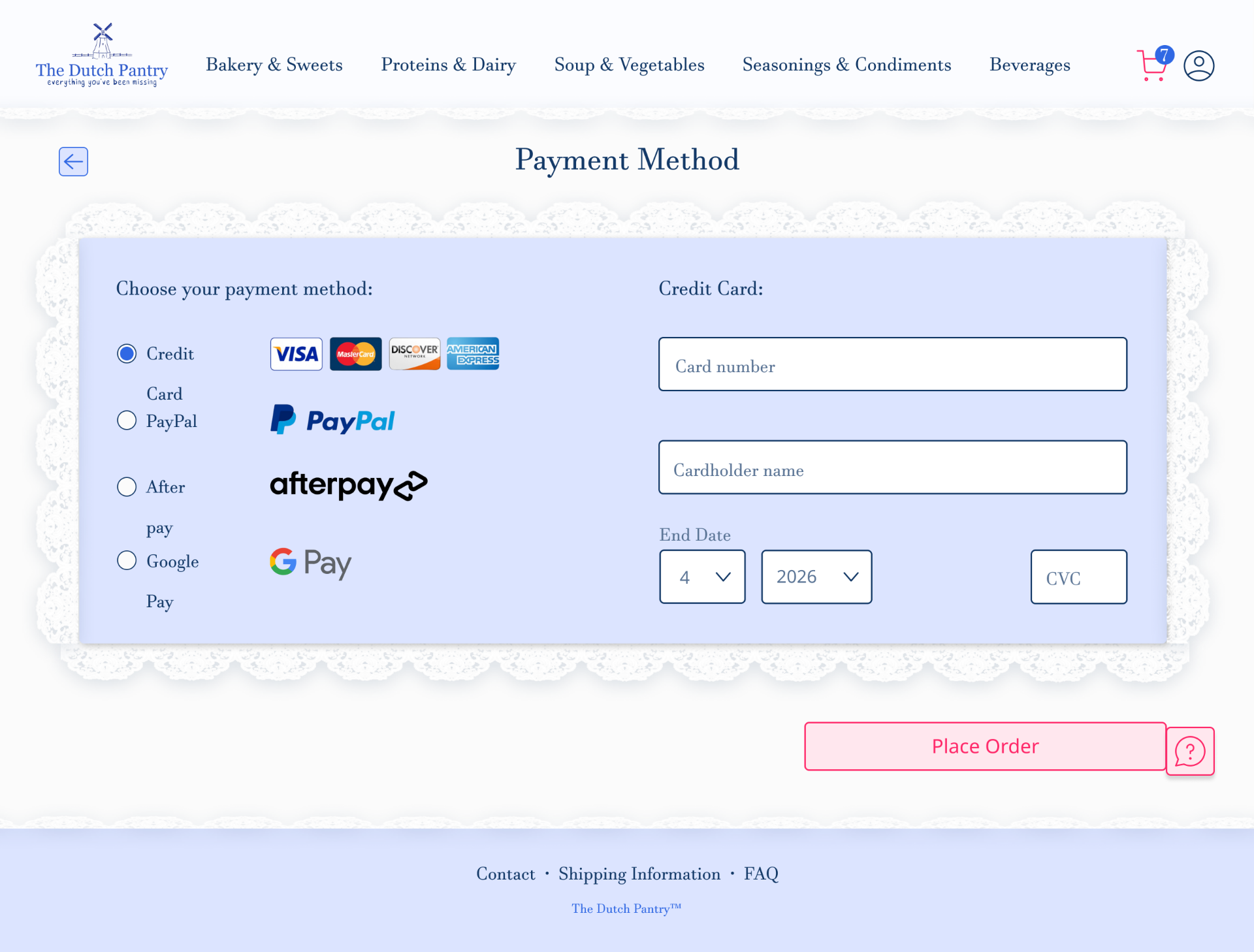
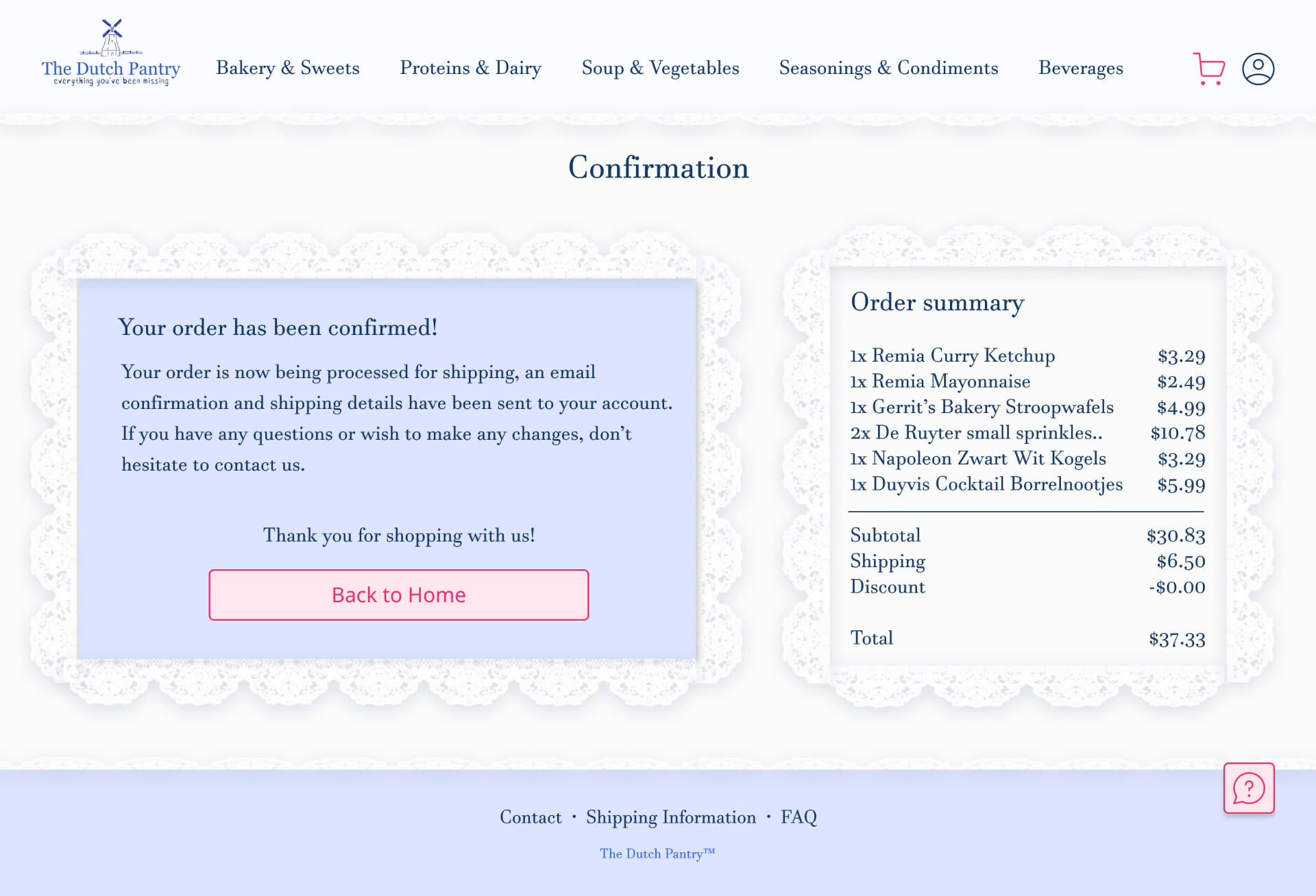
The checkout process is designed in a minimalistic way to limit distractions, while keeping the lace to remain consistent with the rest of the website.
The confirmation page is the last step after payment and gives the user reassurance and feedback that the user's order has been confirmed and showing the order summary on the right side to be more transparent to the user and to give a better overview on what amount of money was spent. If it appears now that they've made a mistake, the message on the left instructs them to contact customer service. If the user is finished reading through his order the user can go back to the home page clicking on the pink button which was marked through the standard call to action color of the design which gives a bigger contrast from the rest.
